ADVERTISEMENT POSTERS FOR V&A
Personal Project | Art Direction, Illustration, Advertisement
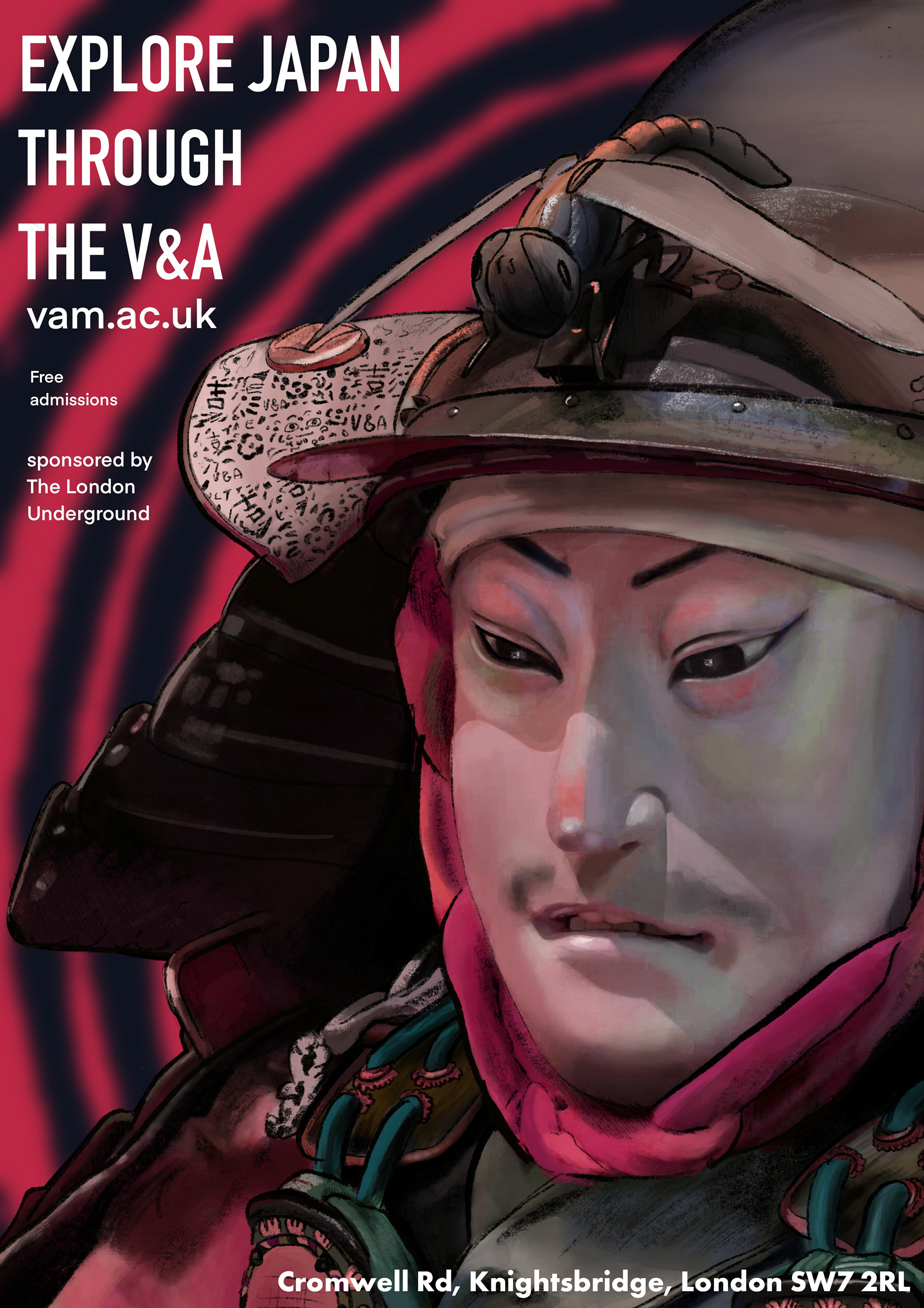
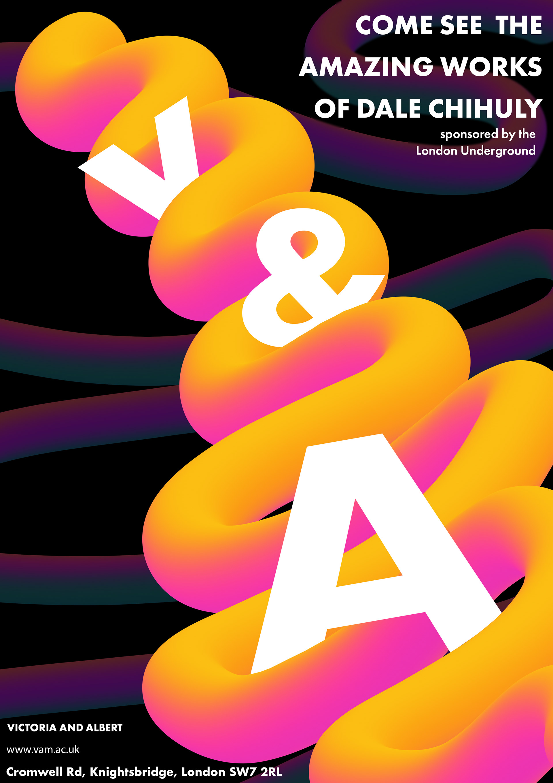
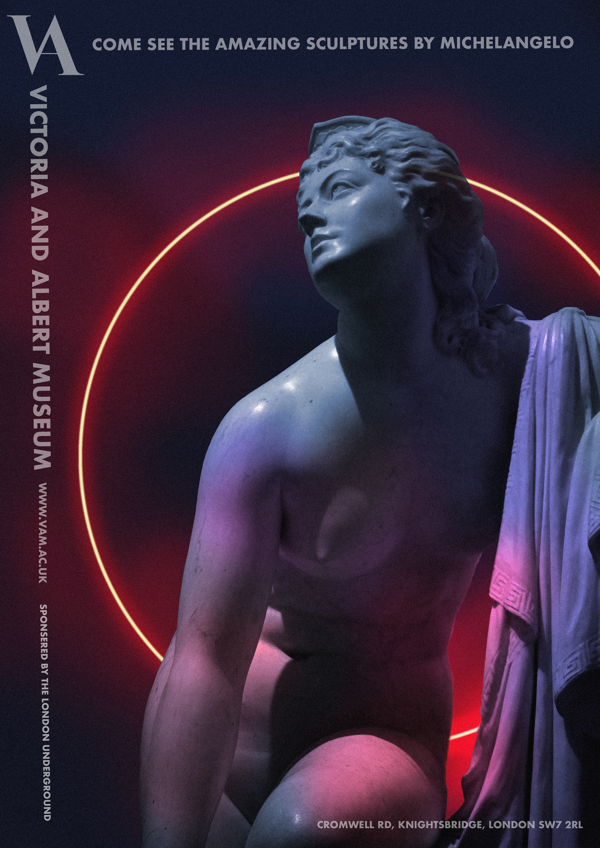
Brif: A series of three posters designed to promote various exhibitions at the Victoria & Albert Museum, specifically tailored for display in the London Underground. Each poster highlights a distinct aspect of the museum's offerings: Japanese artifacts, contemporary glass art by Dale Chihuly, and classical sculptures by Michelangelo.
(A level project 2020 check out more up to date on home page)
Objective: The goal is to create a visually engaging series that not only advertises individual exhibits but also reinforces the V&A's identity as a hub of artistic and cultural exploration. This campaign aims to draw in a broad audience by showcasing the museum’s varied collections in a modern and compelling way.
Concept and Design:
The posters are unified through a bold and dynamic visual style that incorporates my original artwork, photography, and branding elements, creating a cohesive and recognizable campaign. Each design uses vibrant colours and striking compositions to capture the viewer’s attention in the fast-paced environment of the Underground, while maintaining a thematic link that reflects the diverse and rich experiences available at the V&A
Below shows the by breakdown of painting samurai art piece
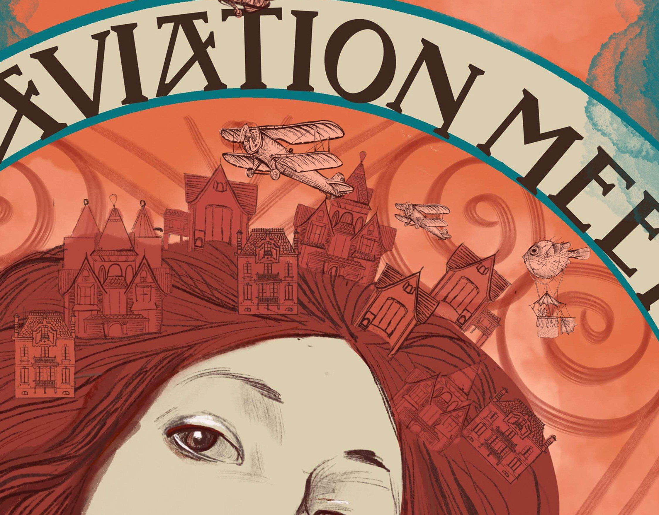
Final Concept Art: Upon closer inspection, you'll notice subtle Easter eggs embedded in the design, such as the V&A logo, some of my recurring characters, and my last name, 彭 (Pang), incorporated into the hat.
The goal was to blend traditional Japanese painting techniques, reflected in the line work, with modern elements, such as exaggerated highlights and the use of digital painting, to create a contemporary yet culturally rich piece.
Quick exploration compositions
I selected Composition 4 for inclusion in my poster series due to its cohesive pink and purple colour palette, which aligns with the overall theme of the collection. The composition also features a stronger structure, with more legible typography and a clear focal point, enhancing its visual impact.
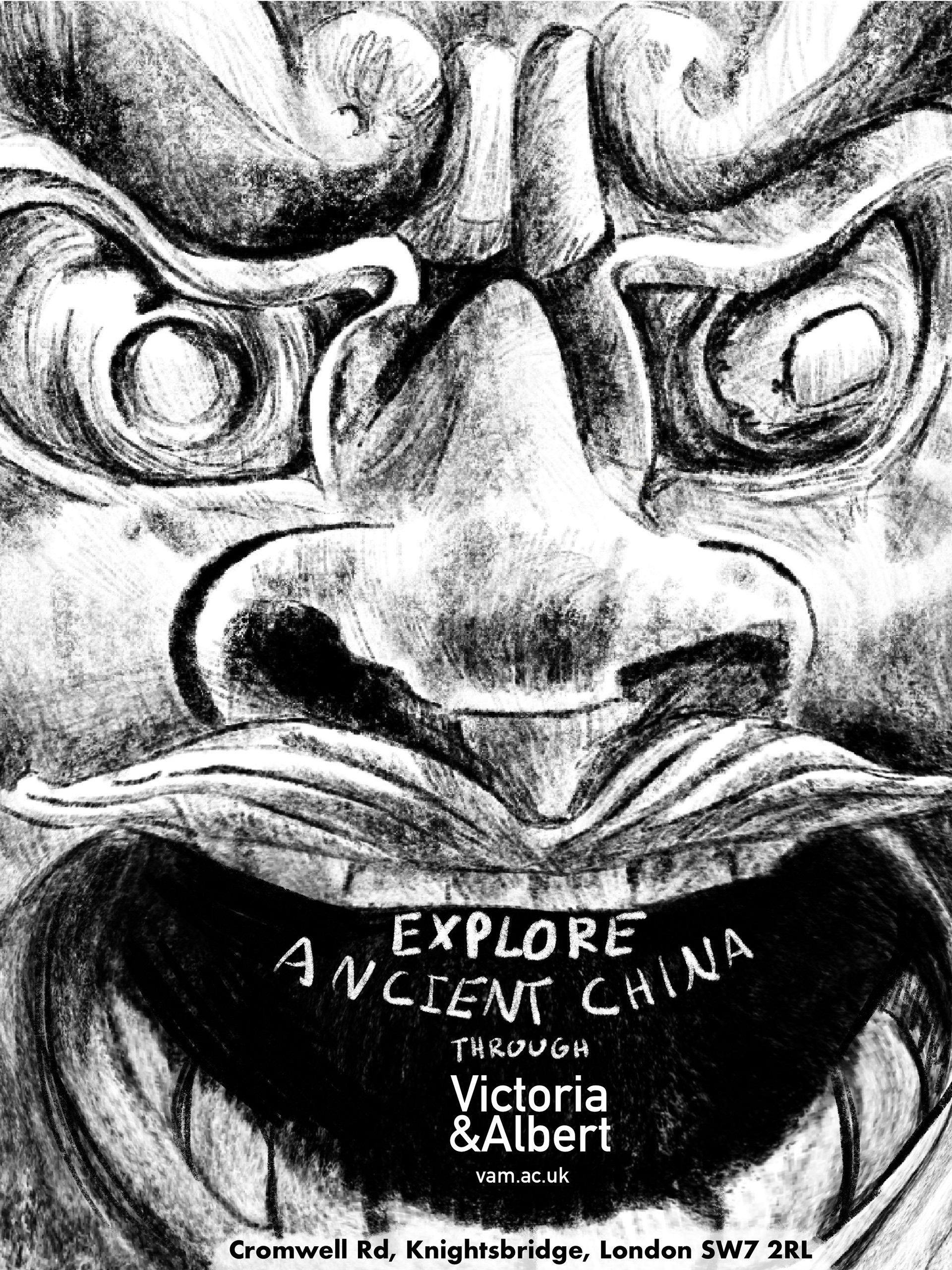
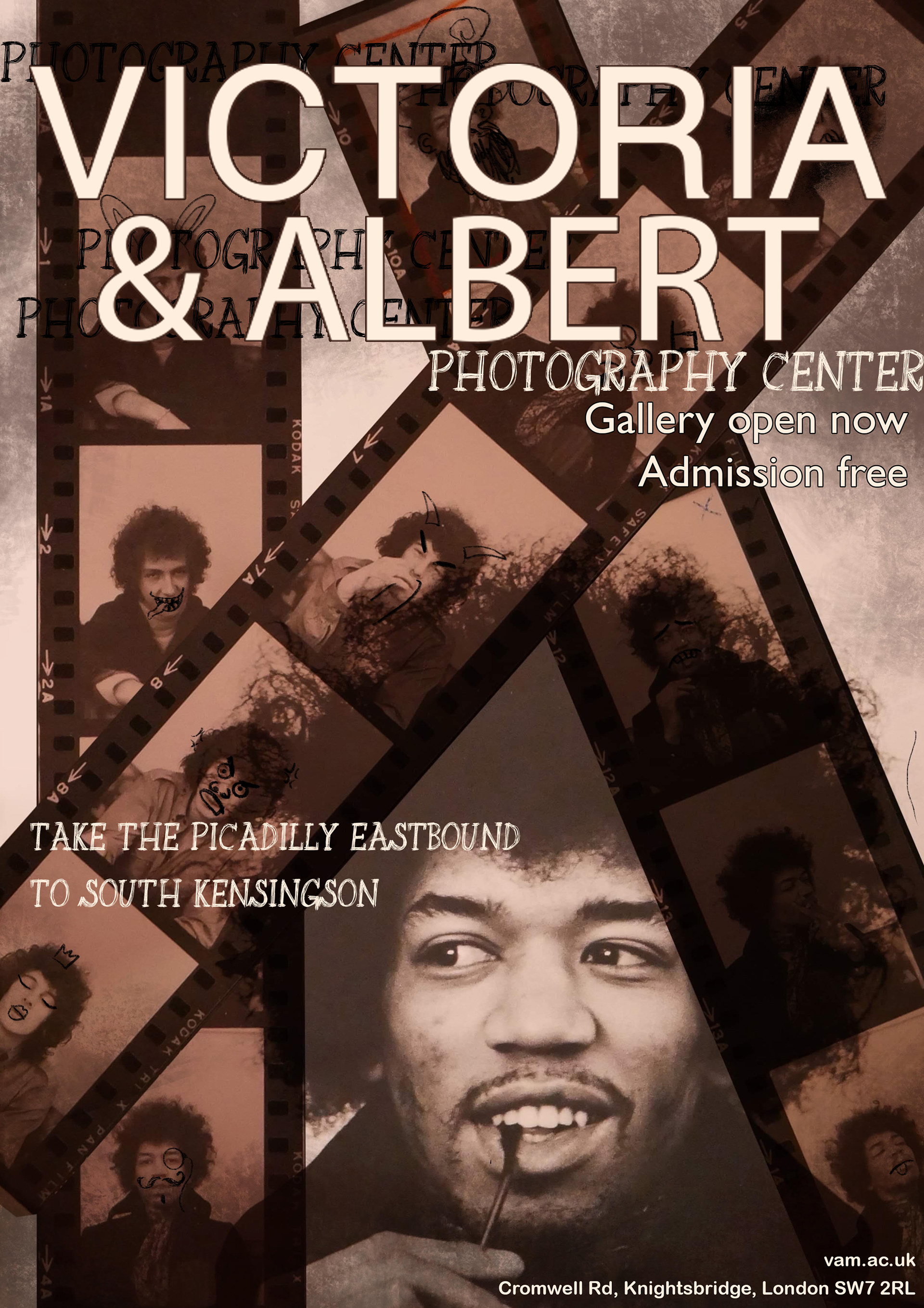
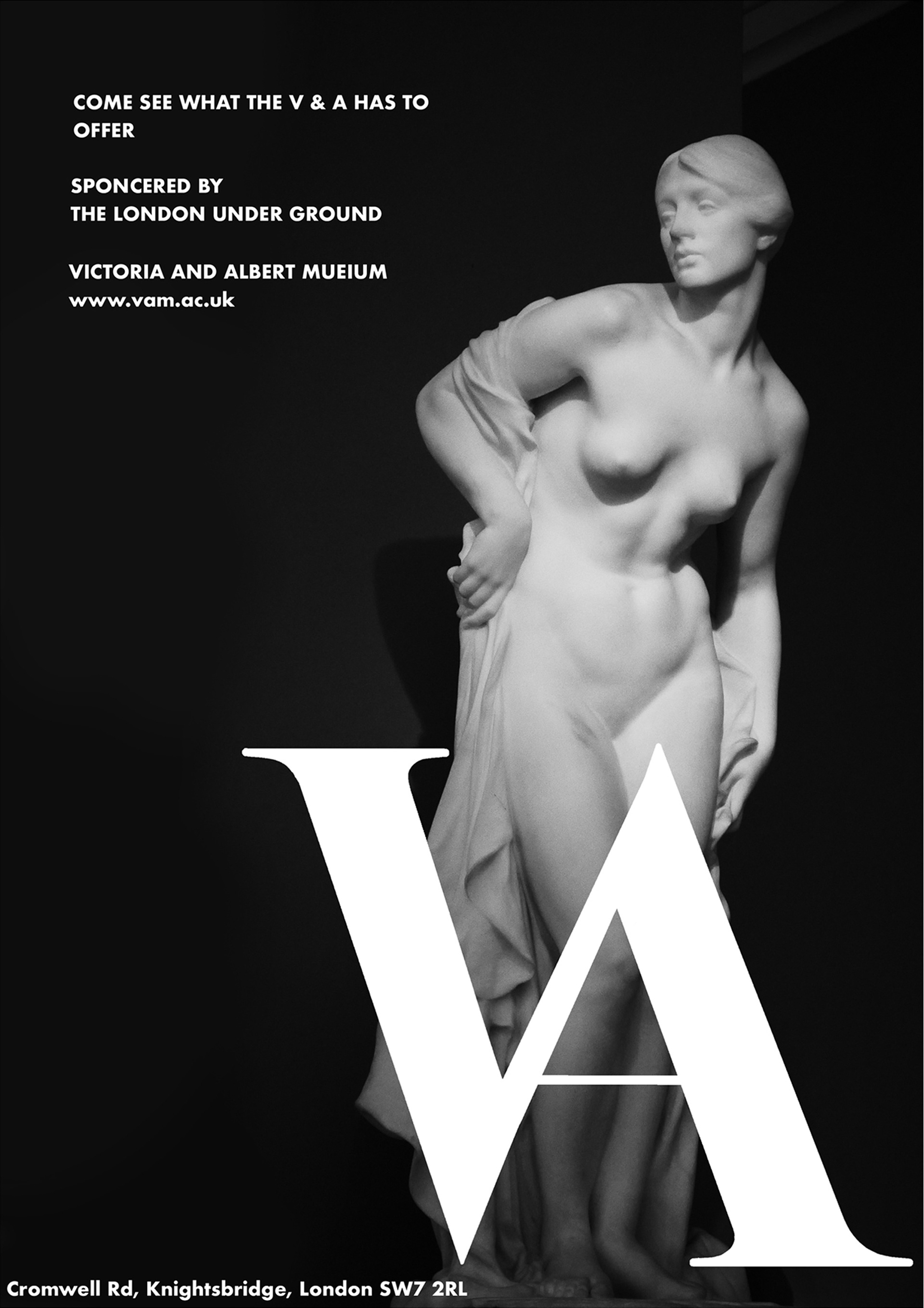
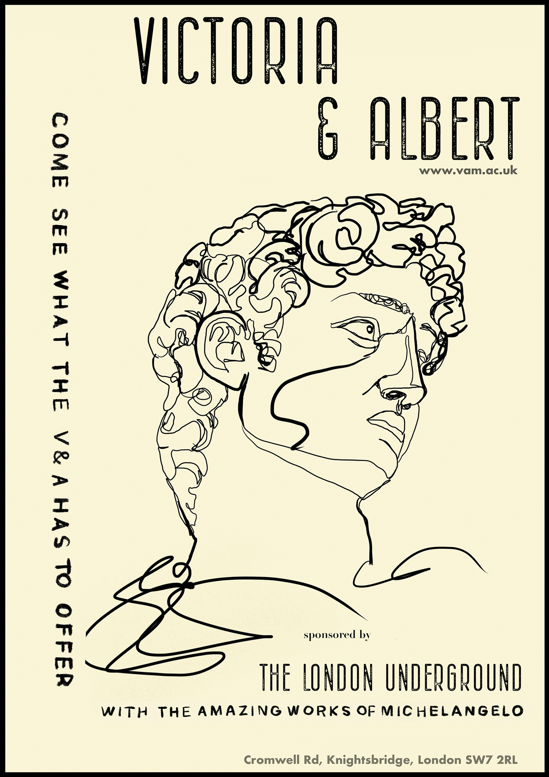
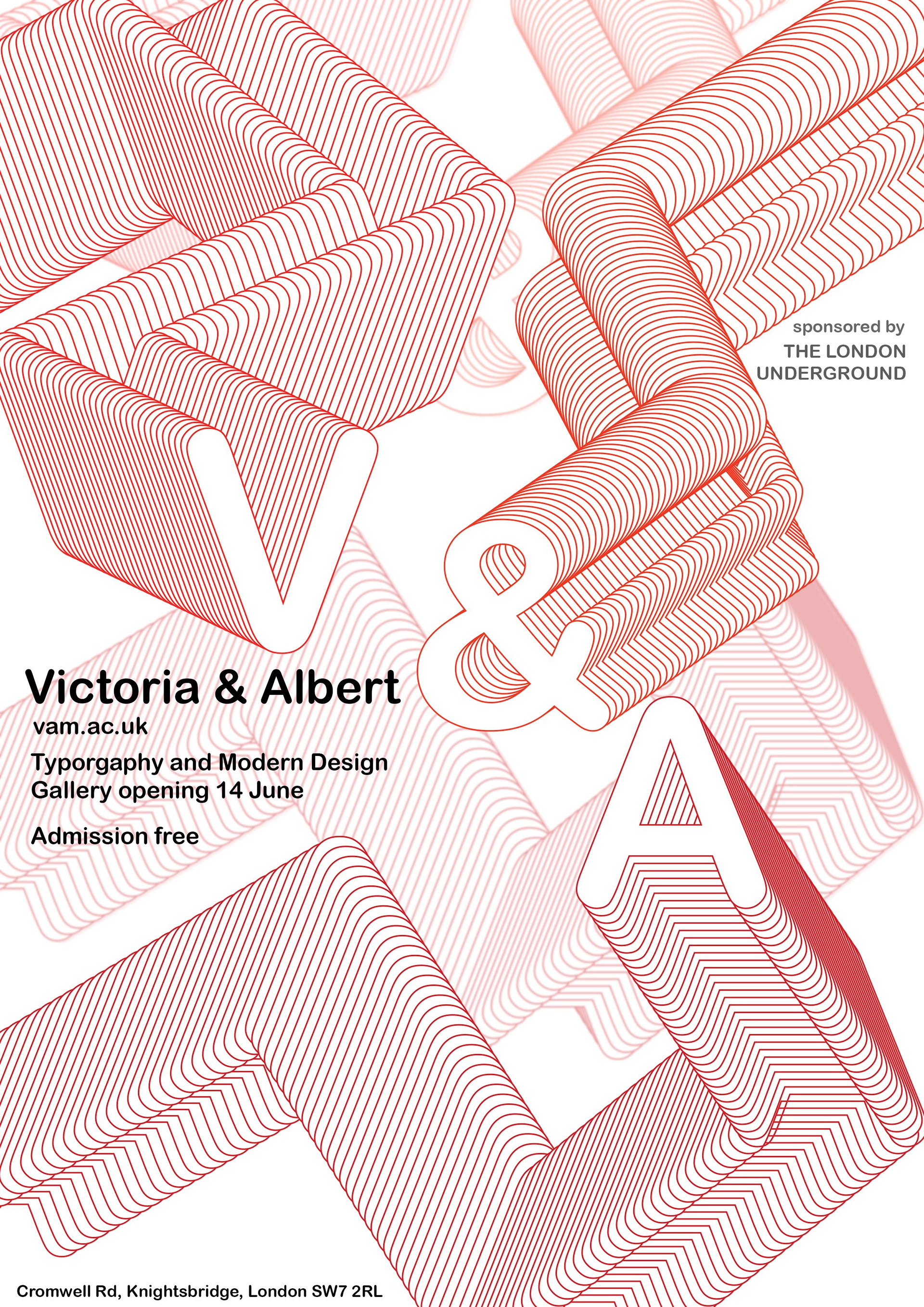
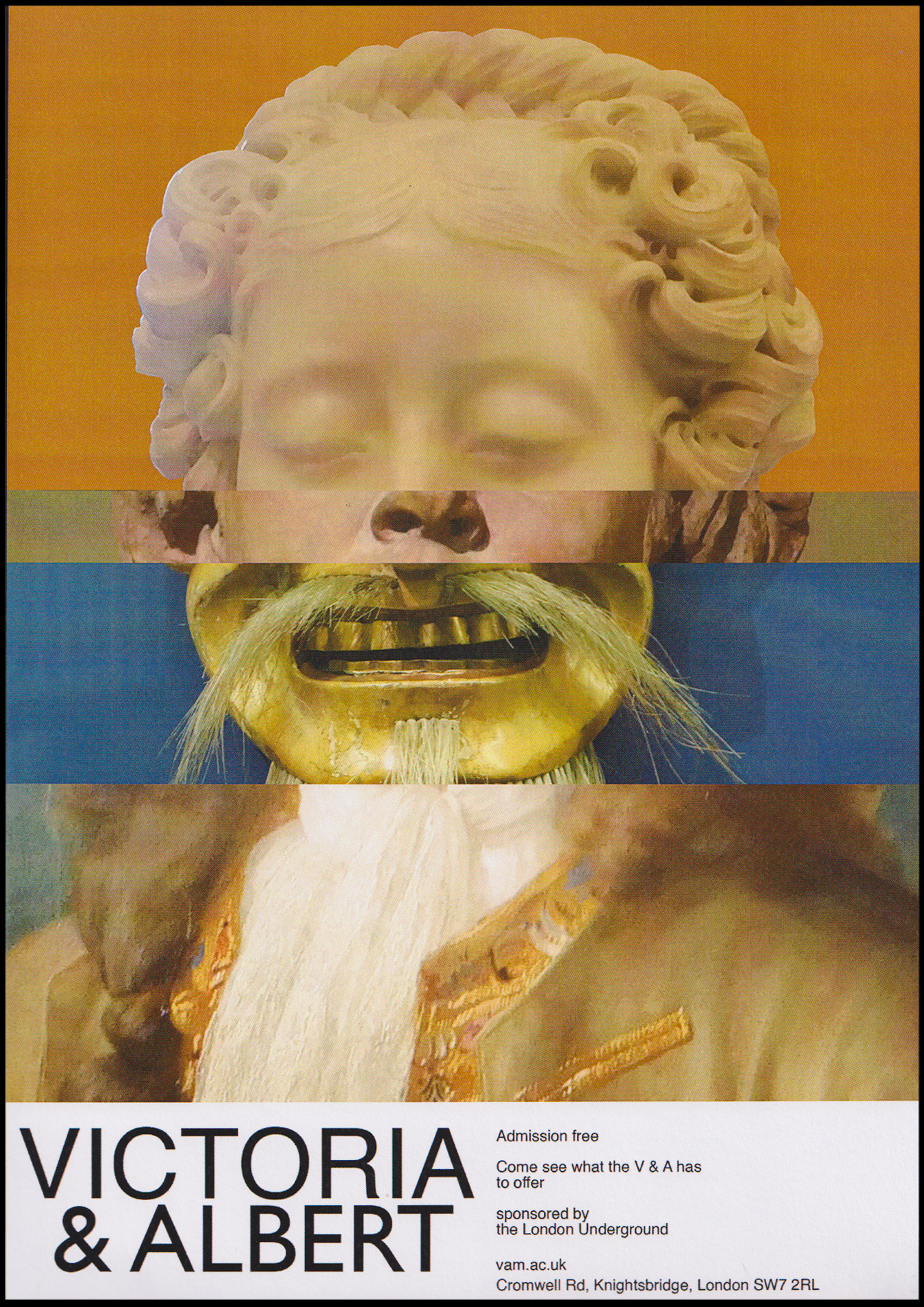
Additionally, here are several poster designs I created for this project, exploring various styles and creative directions that were not selected for the final stages of development.
